Coompanion Ux/Ui
Coompanion promotes entrepreneurship that safeguards social, economic and environmental sustainability. The work results in companies that take social responsibility, local development, and a diversity of ownership models in the Swedish business community. Total Website revamp.

Design Sprint workshop & its 5 phases. Testing out different design patterns and their usefullness for Coompanion.
Understanding: helps the team have a clear picture of the design challenge. The team takes time to learn from experts and engage in creative decision with people from different departments and industries. The problem with the present site was that it was so messy with information everywhere there was no effective way of presenting the information that coompanion wanted to communicate.
Ideate: In this Phase, we created and sprinted ide´s solutions & design patterns. We come up with ideas and build them to create solutions. Each participant makes sketches to show ideas. So we came up with a loot of different ways to make the important information easier to reach for the end-user.
Decide: we filtered through our idés and Decided which solution we wanted to build and create a step-by-step prototype blueprint/sketch.
Prototype: Build the first version of the app/feature. You don’t need a finished product! During this phase, you also finish preparing for user testing.
Testing: Put the prototype in front of users and observe their reaction; at the end you’ll interview them about the experience. And then…iterative design!
Each one of the phases usually occupies one full day of work.
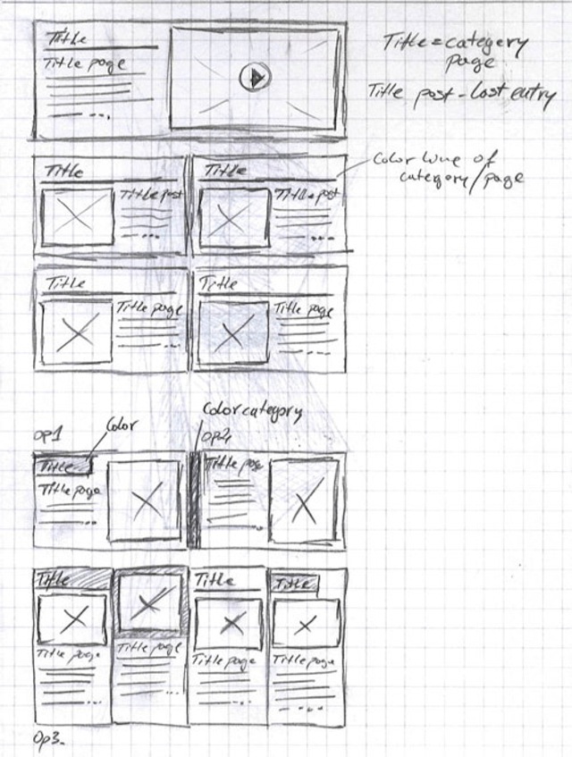
Purpose: The goal was to simplify the user-experience and make important information easy and more accessable to the user.

Process: During the design sprint, the team and I employed sketching techniques to iterate quickly on ideas. Collaborating with the UX team, we focused on sketching for easyer access and highlighting the most important information

Challenges: Balancing aesthetic appeal with functionality was challenging. We had to ensure that the design was not only visually pleasing but also met all usability standards + reached the end goal.

Evolution: My initial sketches were too complex, with unnecessary, so we choose to go with a design members easier version of the sketch and layout.

Outcome: The final sketches were well-received, and tested and we felt met the goal we where designing for.  The clear visual hierarchy and simplified form fields made us confident that we where on the right track.

Learning: This experience taught me the importance of clear design sketching, and not to make them to complex. but easy, fast, fun, and simple.

Figma wireframes outlook is merely a representative picture of the design of coompanions website. the company didn't want to share this information & to show the full extent of the design process and its progression.
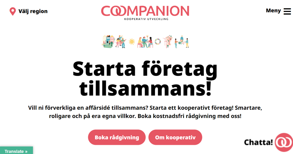
Total rewamp of coompanions website and this is the result. The goal was to focus on transparancy and to increase conversion & views. We incorporated more product information with less space and fitting information, and displayed the service images in a way it would be easier to overview. A/B-testing different features to see what worked best for the users.
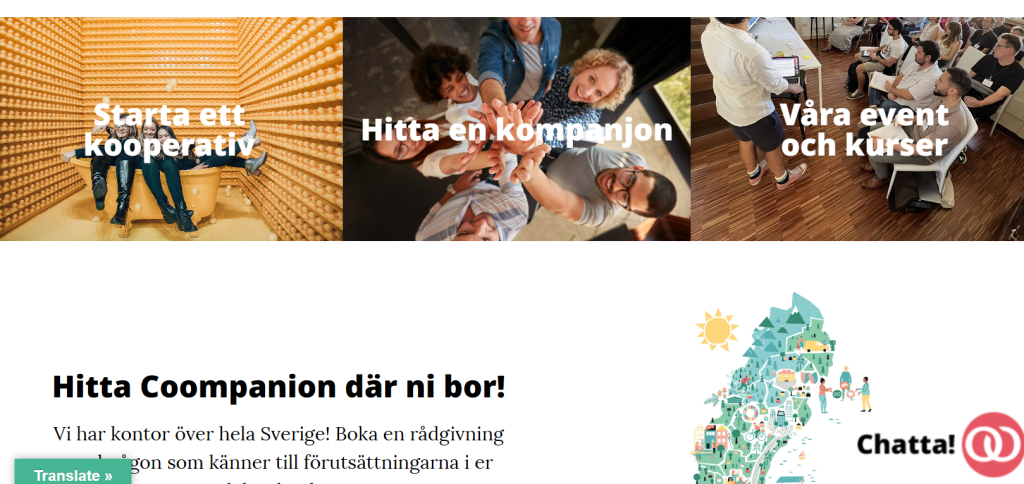
The result of a useful image carousel and a representative interactive CSS model to show that coompanion helps companies & startups across the country in Sweden.

"Coompanion is present throughout Sweden, with 25 independent regional organizations that are owned and governed locally. In our regions, we meet people on a daily basis who want to realize ideas together, in fair and democratically owned companies – cooperatives. Maybe you have an idea in one of our"
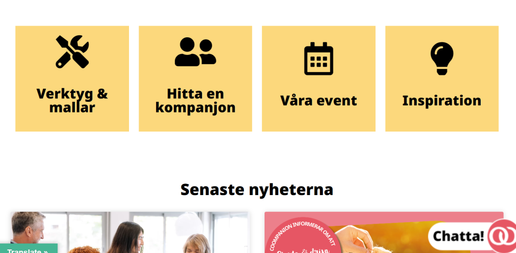
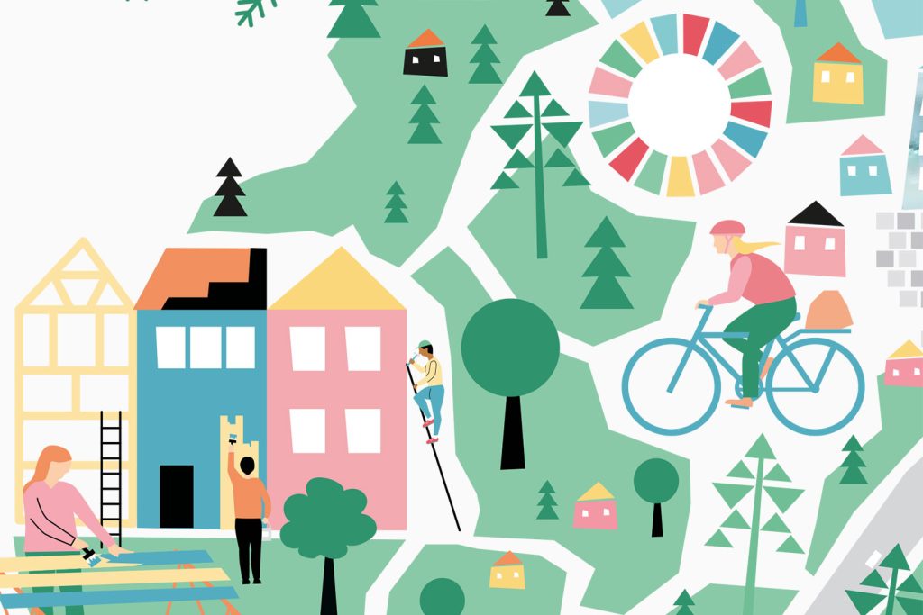
Because I possess strong motion graphics skills the design team and i created this video for coompanion. To present and showcase their business plans & services. to make it easy to understand and widely accessible. Also incorporates the color codes from the design manual in to the video for a seamless experience.
Sketching & my work proccess
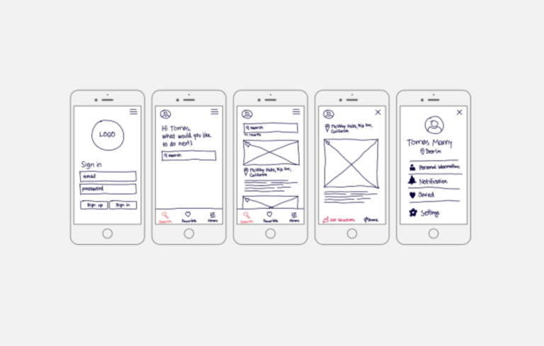
Sketching the basic outline for a possible application to then later move to the Digital Wireframing/Storyboarding depending on the nature of the project i like to use storyboarding even when app designing. Beacuse that creates a story and an connected experience and if you can get the best of both worlds then thats awesome!

Website "manu rewamp" Saluta
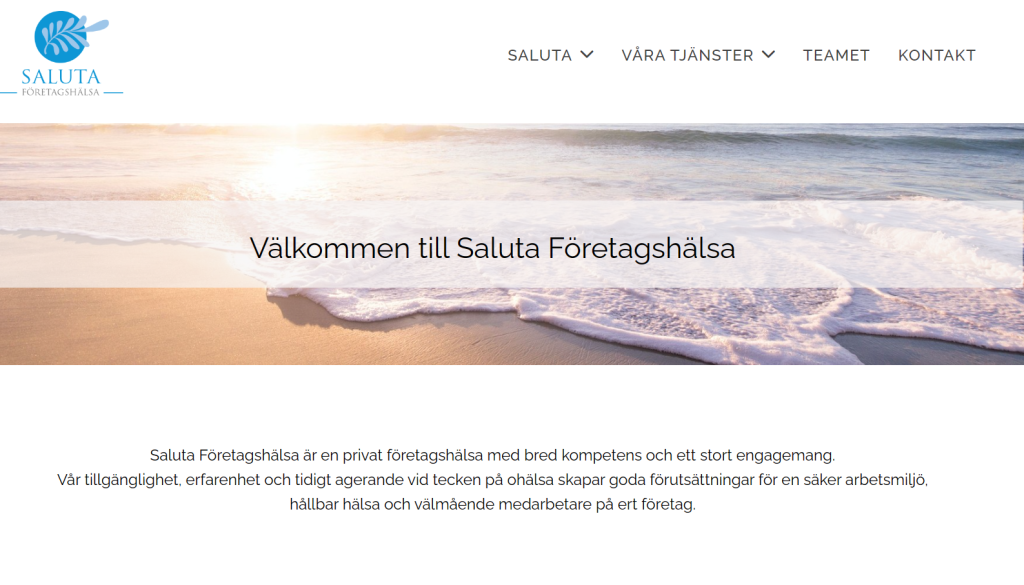
Manu fix short work


